The theme of the challenge was "Tracks" or "Traces".
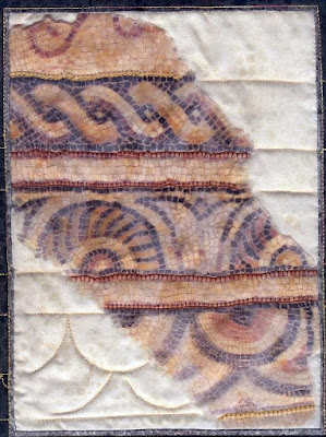
I interpreted that theme using a picture I made during the latest vacation in France of a mosaic at the museum of the Gallo-Roman Villascopia (to enlarge, please click on the pictures):
With an inkjet printer I made a print of this photograph twice; one on organza and one on cotton.
My goal was to achieve a 3D look by placing the organza print on top of the cotton print, holding the two prints together with some stitching:
Due to the printed layer of organza on top of the printed fabric, I can not get the photograph any sharper.
To emphasize parts of the mosaic I painted some details on fabric and seperated them by "Roman blinds" of fabric:
Together with a photograph of a detail (see a previous blog on this subject) I managed to submit this photograph of the quilt:
This was my first attempt using two quilts on top of each other.
In the layers of printed organza on cotton, "traces" can be partly covered and are sometimes difficult to see.
I did not receive a motivation for the rejection and it is difficult for me to guess what the reasons were. I suspect that the rejection is partly based on the un-sharpness in the picture caused by the layering of printed organza on printed fabric.
Now, looking at it again a few months later, I feel it was a mistake to use the organza this way. Printed organza with a printed fabric behind it gives difficulties in focusing for people and digital cameras.
Working with the organza, painting fabric and creating the image of a quilt on a quilt was fun to do. It certainly invites me to use these materials and techniques again in new projects.
I hope I did not bore you with this resume about my rejected quilt.
Thank you for your visit!
More info:
- the Gallo-Roman Villascopia
- Inkjet printable organza: ExtravOrganza
- 240 thread count cotton inkjet fabric: EQ Printables
- Jacquard's Lumiere paint
- previous blog with a detail of a painted part
- Textile Festival Leiden 2010 (only in Dutch)
- PDF's with the rules on the challenge you can find here
- The city of Leiden


I love the quilt even if they didn't. It is such a pity that the photos were difficult. Maybe you can enter it into a non-juried competition. I think the use of the organza gives it the aged and layered feel that you were probably looking for.
ReplyDeleteComing here from Creative Cue, I like the way you interpreted tracks as having to do with the passage of time. The use of organza seemed quite effective. Were the judges working from photos? I wonder if the work you did in the large black border and white areas didn't show up well? Maybe if the white area had more going on? Ultimately though, if the piece says what YOU need it to say, then that is what is important.
ReplyDeleteKaren, thank you very much for your comment.
ReplyDeleteBecause I cannot find your e-mail address at your blog I am answering this way
To my regret the judges were working from photos.
Now I know how to make better photos with the tutorial from 3Creative Studios at:
http://threecreativestudios.com/free.htm
I also did not do much in the black border and white areas, which is a pity indeed
You are absolutely right: as long as the piece says what I had in mind to say then it is okay, but the piece still does not talk to me as I intend it to.
Thanks for sharing your "track" interpretation with Creative Cue. Your quilt is lovely.
ReplyDelete